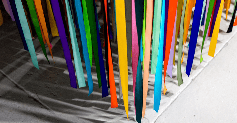
Colours and their applications for Internet marketing and web development:
Blue: Commands respect and authority. Blue is America’s favourite colour. Men tend to see products packaged in blue.
Yellow: Caution, novelty, temporary, warmth, friendliness. Eye registers this colour the fastest.
Green: Secure, natural, relaxed or easygoing, living things. This is associated with nature things such as vegetables and vegetation. Using green colours (or nature pictures with green colours) improve your working productivity (I use a picture of a beautiful waterfall with nice flowers and vegetation around it).
Red: Human, exciting, hot, passionate, strong, intense, dangerous. This colour has its power based on the fact that blood, a sign of danger or death, has this colour. We are hardwired to understand this regarding this colour. Anything with red colours makes it look exciting most of the times.
Orange: Powerful, affordable, informal. This catches attention easily and that is why it is used mostly on Buy Now buttons (think PayPal, Amazon and eBay).
Brown: Informal and relaxed, masculine, nature. Men tend to like products packaged in brown.
White: Goodness, purity, chastity, cleanliness, delicacy, refinement, formality. Can be preceived as clean, scientific (think stereotypical scientist in their white rocks) and authoritative (think doctors in white rocks).
Black: Sophistication, power, authority, mystery. High-tech electronics use this to appear more interesting and black is common clothing so the person wearing it looks more powerful and authoritative.
Pink: Feminine, childish, playful, cute, sexual. This colour is mostly culturally-based and due to socialization defining this colour for women, it is perceived as such. This colour is used heavily, and successfully so, on female products and services.
Purple: Magical, mystical, spiritual. This colour gets its perceptions from culture where you see most magic effects in purple (think of old Disney movies where witches use their wands) and since spirituality is beyond the natural world that too has an association to the purple colour.
Silver, Gold, Platinum: Regal, wealthy, stately. Suggests premium price and luxury.
Grey: Neutral, boring, death. This colour by itself can look very boring or dull, but combining it with others or using it as background can give a nice soft touch to the page instead of a typical contrasting white colour that usually “yells” more than it soothes the user seeing it.


